A good email signature answers two questions without being noticed: who is this, and how do I reach them. Everything beyond that (banners, quotes, six social icons, the scanned handwriting) is noise the reader pays for on every single email you send. The examples below cover the ten situations that account for nearly every signature, with a note on why each works.
Want to skip straight to building? Our free Gmail signature generator produces a clean, Gmail-ready signature in about a minute; this page is the taste-and-judgment layer on top of it.
Name, role, two contact routes, done. The default that fits everyone and offends no one. If in doubt, use this.
Senior Account Executive
Meridian Software
m: +1 (312) 555-0147 | w: meridiansoft.com
120 N Wacker Dr, Chicago, IL
The full-details version for client-facing roles at companies that expect an address block. Keep it to five lines.
One colored border adds identity without images, so it survives every email client and dark mode.
JP | James Park Customer Success Lead, Attio [email protected] | +44 20 7946 0958 |
A photo builds recognition in support and success roles where the relationship is the product. Use a table layout, never CSS floats: tables are the only layout Gmail and Outlook both respect.
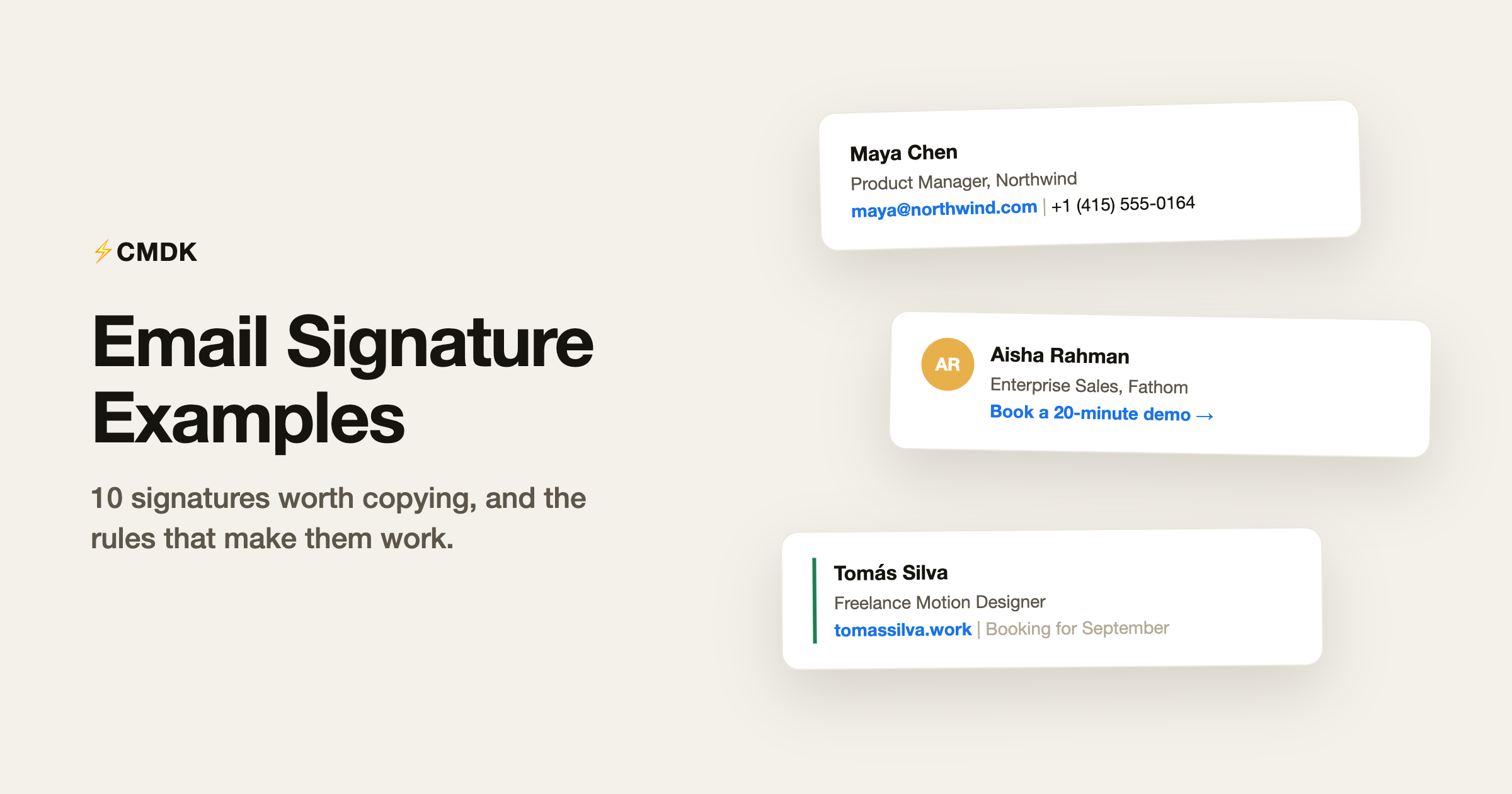
AR | Aisha Rahman Enterprise Sales, Fathom Analytics +1 (646) 555-0192 | fathom.io Book a 20-minute demo → |
One call to action, stated as a link, not a button image. Two CTAs halve each other’s clicks.
Senior signatures shrink, not grow. Three lines signals that everyone already knows how to reach you.
The availability line does quiet marketing in every email. Update it monthly or delete it.
Recruiters earn the LinkedIn link; most other roles just add clutter with it. The open-roles link converts passive readers.
Reply signatures inside a thread should be near-invisible: first name, team, and where to self-serve. The full block belongs only on the first message.
LK | Lena Kowalski MSc Computer Science, TU Munich · Class of 2027 [email protected] | GitHub | CV |
Degree and graduation year replace the job title. Link the CV; do not attach it to every email.
The rules behind all ten
Every example above follows the same five rules, and they are worth internalizing before you customize:
- Three to five lines. Name, role and company, one or two contact routes, at most one extra link. Anything longer competes with your actual message.
- Use text. Image signatures break in dark mode, get blocked by default in many clients, are invisible to screen readers, and their contact details cannot be copied. If you want a logo or photo, make it one small element in a text signature, never the whole signature.
- Tables for layout. If your signature has columns (photo beside text), build it with an HTML table. Gmail and Outlook disagree on nearly every layout technique except tables.
- One accent, maximum. A single brand color on a border or link reads as design; three colors read as a flyer.
- One call to action, if any. “Book a demo” or “See open roles” earns its line in sales and recruiting. Two CTAs split attention and halve each other.
What to leave out
The most common signature mistakes are all things people add:
- Inspirational quotes. They age badly and read differently to every recipient. If the quote matters to you, it belongs in your bio; invoices can arrive unaccompanied by Gandhi.
- The full social icon row. Link the one profile relevant to your work, or none. Six gray icons say “I copied a template”.
- “Sent from my iPhone”. Delete it or replace it with a real signature; the only thing it adds is an apology.
- Legal disclaimers, unless legal requires them. The unenforceable confidentiality paragraph triples signature length for zero benefit. If compliance mandates it, fine; if habit does, cut it.
- Degrees and certifications outside contexts that need them. MBA in a sales signature reads as trying too hard; the same letters in a consulting proposal are load-bearing.
Reply signatures: the part almost everyone gets wrong
Your full signature belongs on the first email of a thread. Every reply after that should carry a short version, your name or name plus company, like example 9 above. Gmail supports this poorly out of the box (one signature per account, plus a per-send manual switch), so most people either repeat the full block eight times per thread or give up on signatures in replies entirely.
Fix it once: Gmail’s Settings, General, Signature lets you set a different signature for new emails versus replies. Set the reply version to your name alone and stop thinking about it.
Setting your signature in Gmail
Copy any example above into Gmail: Settings gear, See all settings, General tab, scroll to Signature, click Create new, paste, and adjust. Assign it to new emails (and a shorter one to replies), save at the bottom, and send yourself a test. The signature generator outputs the same thing with your details already filled in, plus layout and accent options from the examples on this page.
Frequently asked questions
What should a professional email signature include?
Name, role, company, and one or two ways to reach you, in three to five lines of plain text. Add at most one extra element that earns its place: a booking link for sales, a portfolio for creatives, open roles for recruiters.
What is a good email signature for someone without a job title?
Use what you are instead of a title: “MSc Computer Science, TU Munich, Class of 2027” for a student, “Freelance Motion Designer” for independent work. Name plus context plus one link covers anyone.
Should my email signature have a photo or logo?
Optional, and only as one small element beside the text, laid out with an HTML table. Photos help in relationship-heavy roles like customer success and recruiting. Never make the entire signature a single image: it breaks in dark mode, gets blocked, and cannot be copied from.
Are email signature quotes unprofessional?
In most business contexts, yes, they read as clutter at best and as a statement you did not intend at worst. The signature is contact information; opinions and inspiration live better anywhere else.
How do I make my email signature look good in both Gmail and Outlook?
Keep it text-based, use a table for any multi-column layout, use one accent color, and avoid custom fonts (both clients fall back unpredictably). Then send a test to an Outlook address, because that is where fancy signatures go to die.
Build yours in a minute with the free signature generator, and if you send the same emails around that signature every day, CMDK‘s snippets fill in the rest of the message too.